Pretty Pots
Identity / Brand / Print / Digital
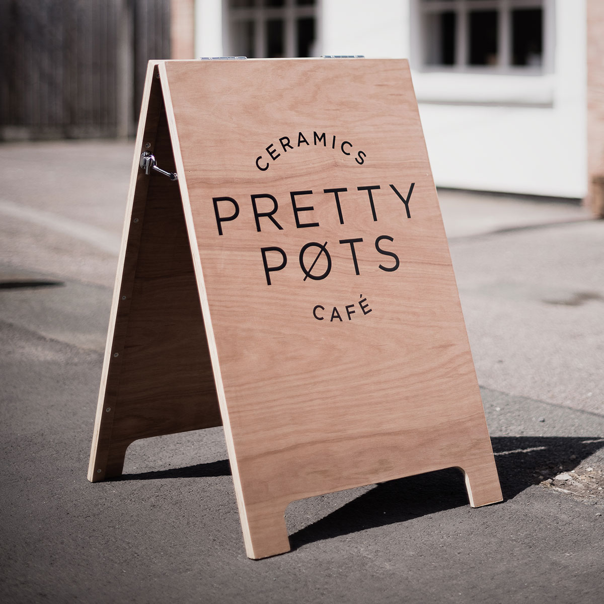
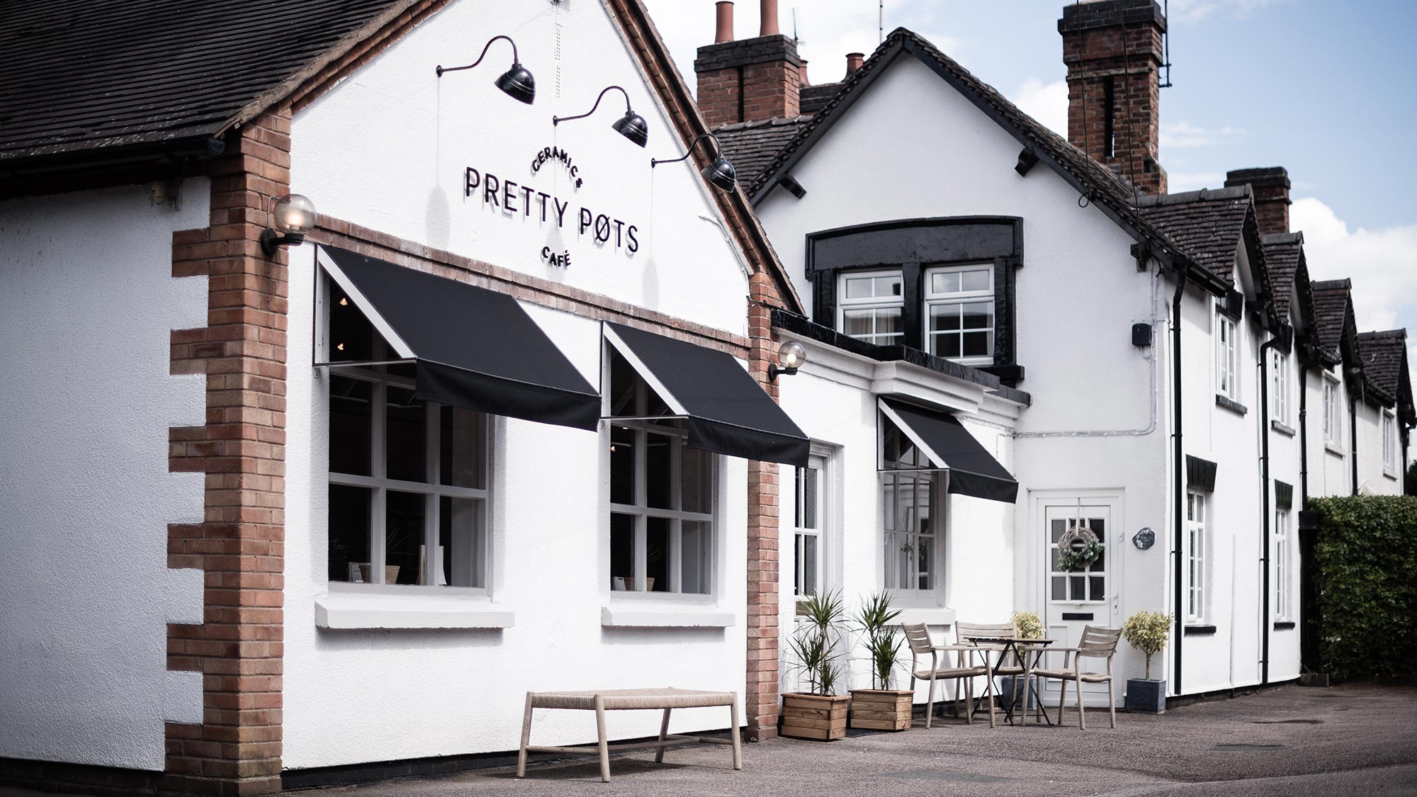
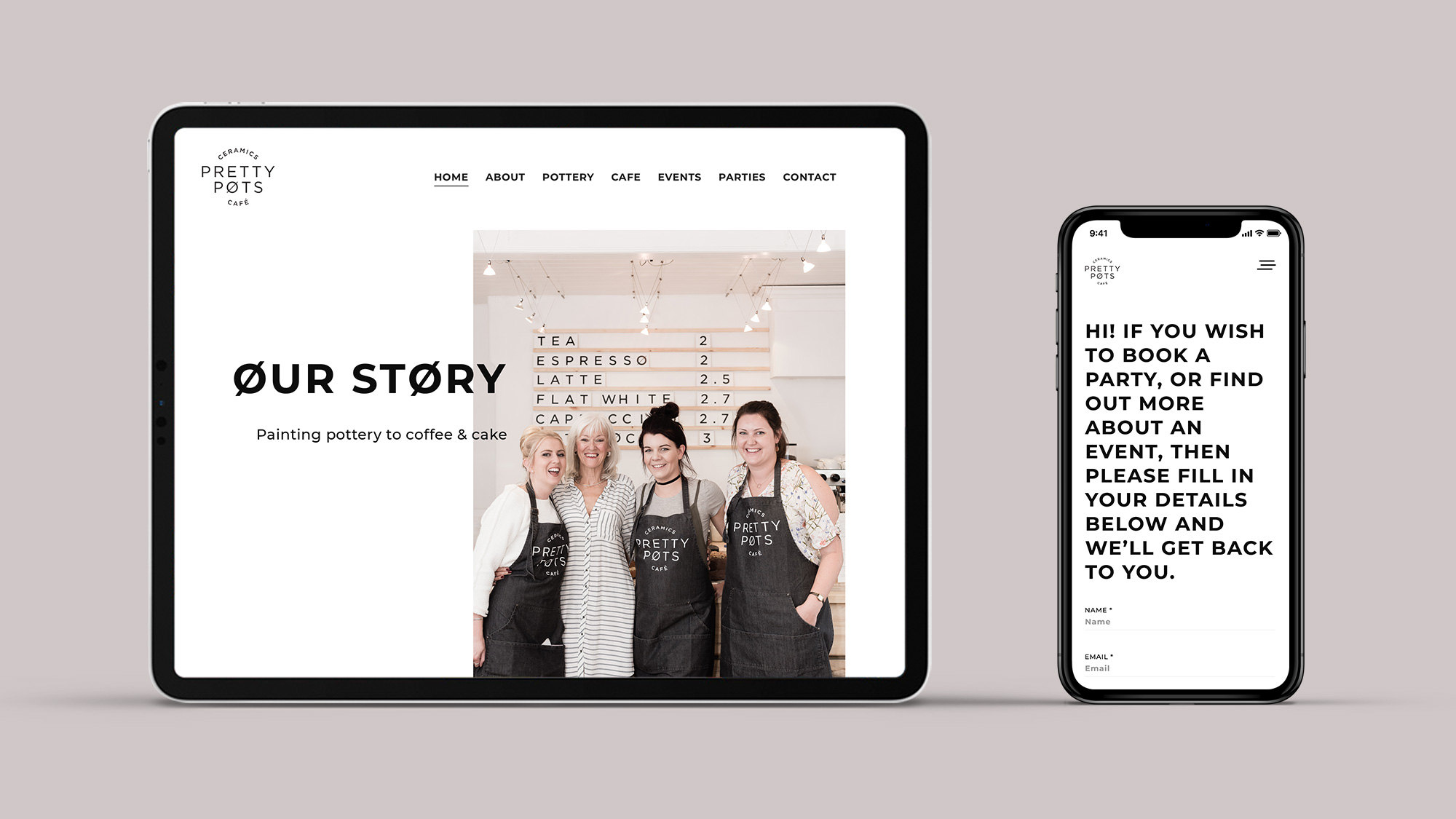
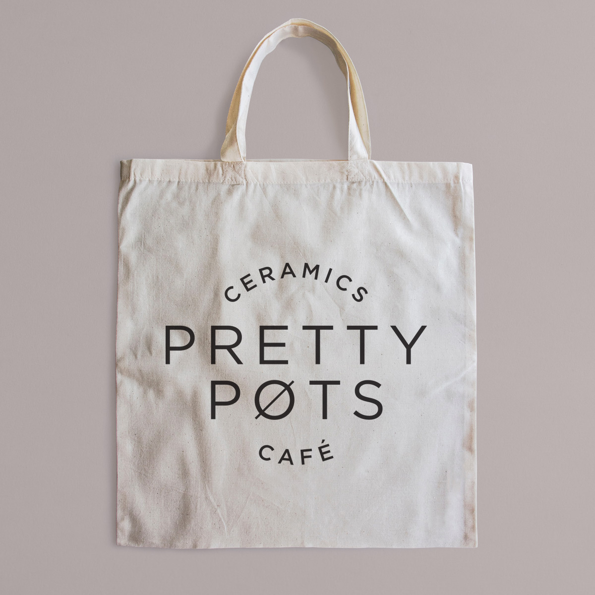
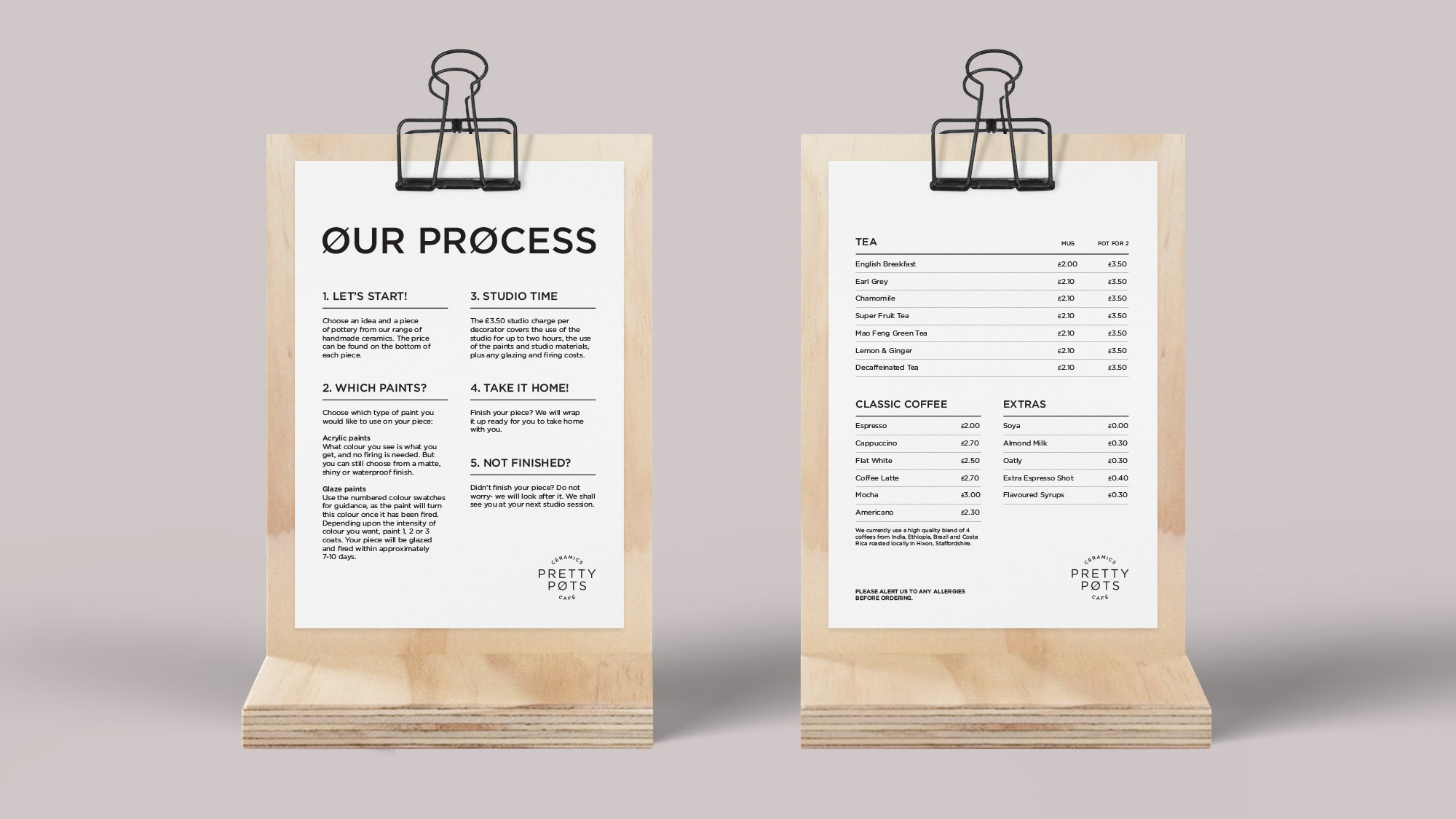
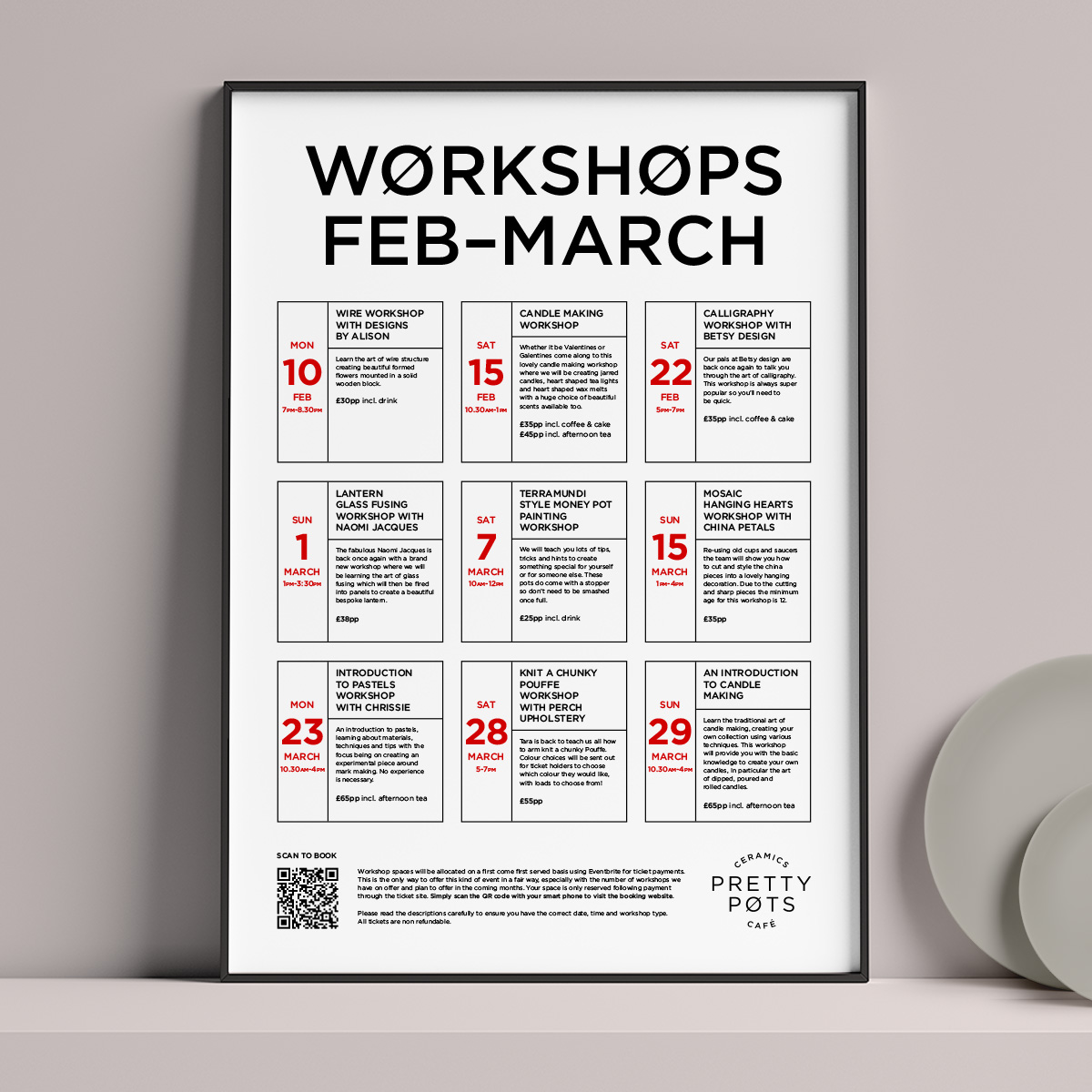
The thriving start up ceramics café, Pretty Pots, needed a complete brand creating to help with its speedy growth. The identity had to be unobtrusive, clean and translate the calming effect of the café’s environment. The brand was developed in a monochrome colour palette, using clean, sans typography. Giving a flexible brand to run across signage, menus, interior communications and digital social channels. A simple, inspiring and responsive website was then developed to help customers find out more about the café, the pottery process and future events.
Location photography: Paul Haywood
![](https://adamkolakovic.co.uk/wp-content/uploads/2020/03/pretty_pots_process-1.gif)
![](https://adamkolakovic.co.uk/wp-content/uploads/2020/03/pretty_pots_a-board.jpg)
![](https://adamkolakovic.co.uk/wp-content/uploads/2020/03/pretty_pots_shop_front_1-1.jpg)
![](https://adamkolakovic.co.uk/wp-content/uploads/2020/03/pretty_pots_digital-2.jpg)
![](https://adamkolakovic.co.uk/wp-content/uploads/2020/03/pretty_pots_tote_bag-6.jpg)
![](https://adamkolakovic.co.uk/wp-content/uploads/2020/03/pretty_pots_menu_board.jpg)
![](https://adamkolakovic.co.uk/wp-content/uploads/2020/03/pretty_pots_menus-4.jpg)
![](https://adamkolakovic.co.uk/wp-content/uploads/2020/03/pretty_pots_apron.jpg)
![](https://adamkolakovic.co.uk/wp-content/uploads/2020/03/pretty_pots_workshop_poster_1-3.jpg)